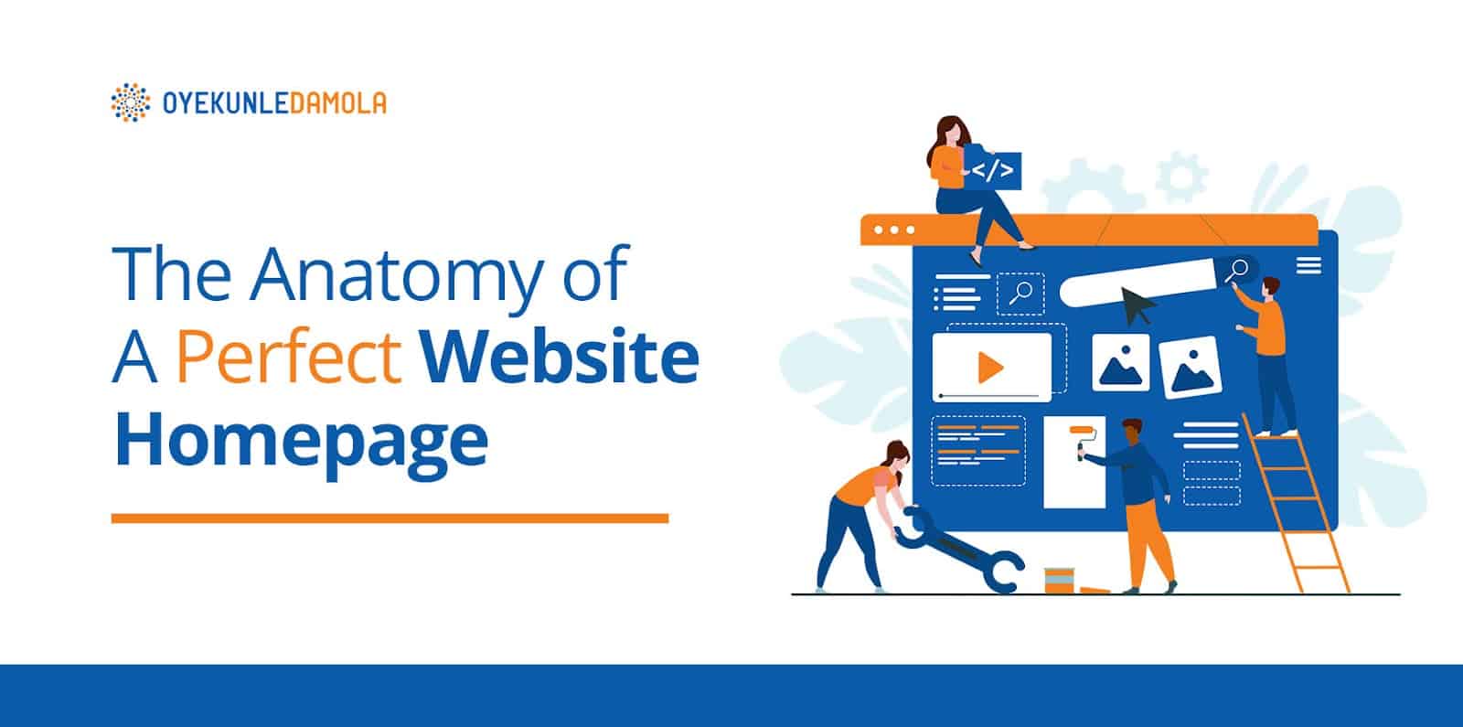
Imagine this: You need the services of a legal practitioner, you have a few options in mind and decide to visit one of them. However, the first thing you see when you visit the first office are broken windows, leaky roof and rundown walls and carpeting. No one needs to tell you before you turn back out, right?
Now imagine having a terrible website homepage with low quality images, vague content and that takes forever to load. I can tell you that no visitor will stick around to further explore what you have to offer, even if you have a great product.
A website’s home page is the first thing that people see when they arrive on your site. Designing a good website can make the difference in what impression you send out and how well you motivate your visitors to convert.
There are many elements that contribute to making a great website homepage. If done right, they add up to an overall experience that is friendly, memorable, helpful to your visitors while also persuasive & appealing enough to get them reaching for their card details to buy from you.
To improve the performance of your homepage and offer your visitors a great user experience, here are 9 key elements of a perfect website Homepage.
These 9 elements, if effectively implemented, can increase your website conversion rate (CRO) meaning that it will help you increase the rate at which you achieve your set goals for your business or personal website. e.g. Increase sales, engagement etc.
Let’s Dive in!
Top 9 Elements of a Perfect Website Homepage
#1 Logo and branding elements
You have worked hard to create your products and services. However, no matter how unique your product is or how much value it offers your customers, there will always be competitors.
Having a logo on your website homepage ensures you stand out from others doing the same thing as you do.
A well-designed logo will increase brand recognition and eliminate customer confusion. In fact, your logo might be the only way your customers are able to recognise your website.
When designing your website homepage, you can position your logo on the top left hand corner or have it at the center of the navigation page where it is hard to miss.
Check out how Google Drive prominently displayed its logo at the left hand corner of their homepage. Users can easily recognise their brand just by seeing the logo and so, it makes sense to include it.
#2 Clear Headlines
When a visitor lands on your homepage for the first time, they should be able to tell what your website is all about within 3 seconds.
A clear headline is one of the most important elements on your website’s homepage. It is key to explaining your offer and what your customers can expect to get from your business.
When crafting a headline, you want to use clear and simple terms in a language that best resonates with your target audience. They can be 2 to 3 sentences long and should be targeted to your audience’s needs.
It should also be clear to read on any kind of device so you want to use large fonts that are well optimized for mobile viewing.
Best practise is to use the headings arrangement on your page editor. For example, your main headline could have an H1 tag while the sub headline has an H2 tag and so on.
Quick Mail is such a great example of a website homepage with a clear and simple headline. In crafting their copy, they used simple language that highlights the benefits their users get- better email automation. They also supported the main headline with a sub-headline that better enforces the benefits of their software.
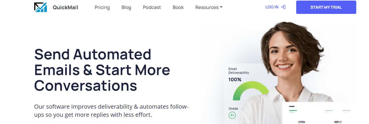
Quick lessons from QuickMail about writing your headlines.
In writing your headline, aim to achieve the following
- Communicate the benefit of your business in clear and simple words (Your Bold Main Headline)
- Support Main headline with an irresistible subheading.
- Give your visitors a visual overview of the benefits of your products.
#3 Clear Navigation
Want to reduce the bounce rate on your website? Then have a clear and intuitive navigation.
Your readers don’t have time to start figuring out how your website works. People need to have a clear view of what is on offer and how they can easily locate what they need.
Generally, it should not require more than 3 clicks before your users find the information they are looking for.
Place the navigation system on the top and left side of the page- with tabs like About us, Contact us, Site Map and other relevant information clearly listed.
A search box will come in handy if your website has a lot of content. The goal here is to be clear, consistent, structured and intuitive.
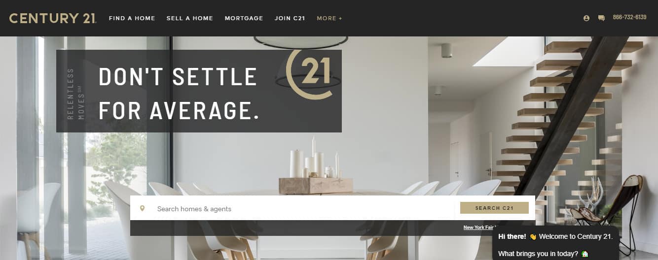
With Century21, helping their visitor find what they need easily is key here. They have been able to include simple menus at the top of their page that help users easily navigate their site.
There is also a search bar that makes the process of finding relevant information straight to the point.
How else do you think you can make your website navigation easier for your visitors? Share with me, I want to learn from you, so drop in the comment section
On to the 4th Element…. ????
#4 A compelling CTA: Primary and Secondary
The goal of your website’s homepage is to generate interest in the minds of your visitors and encourage them to take a specific action.
A Call to Action (CTA) is what helps move your visitors down the funnel across different stages of the buying cycle. They are the buttons you use on your website to drive your audience towards your goal conversion.
A perfect website homepage should have 2 to 3 call to action buttons that are easy to spot and help people interact with your business in a relevant manner.
Your button color matters and ultimately depends on your site design. They should stand out and be designed in a color that contrasts with the rest of the elements on your homepage, while still fitting in with your overall brand color and website design.
Call to actions buttons should feature action-oriented words that motivate actions. You want to use clear terms such as:
- Yes! I want X
- Do you want to X?
- Add to wishlist
- You are running out of time!
- Activate X today, etc.
Also, you want to make sure your primary call to action button is the biggest and brightest. This is the call to action button designed to drive the most desired action you want your visitors to take. It should stand out and be clear to any one browsing on your site.
The secondary call to action buttons, which is the alternative action you want your prospects to take, should be less attention grabbing.
In this example, CarMax caters to two different kinds of audiences-those that want to buy cars and those wanting to sell. They have been able to avoid customers confusion by including simple and clear multiple CTAs that appeal to both groups of audience.
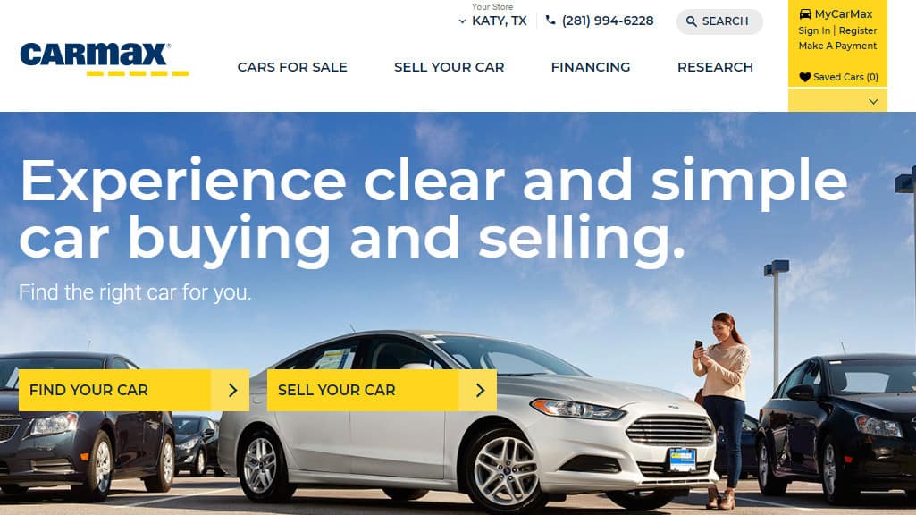
Lessons from CarMax
Why would your customers come to you? Why would they buy from you?
Articulate that as well the variety of service options you offer and create clear CTA (s) that draws them in that direction without confusion.
#5 Benefits
A user landing on your homepage seeks to understand what you do and what is in it for them. The benefits of your product/services should be clearly written in a language that your user can relate with. You want to use simple terms that are compelling and easy to understand.
Notice how Mint, a personal financial website and app, listed benefits of their services in simple terms that the average user can relate with.
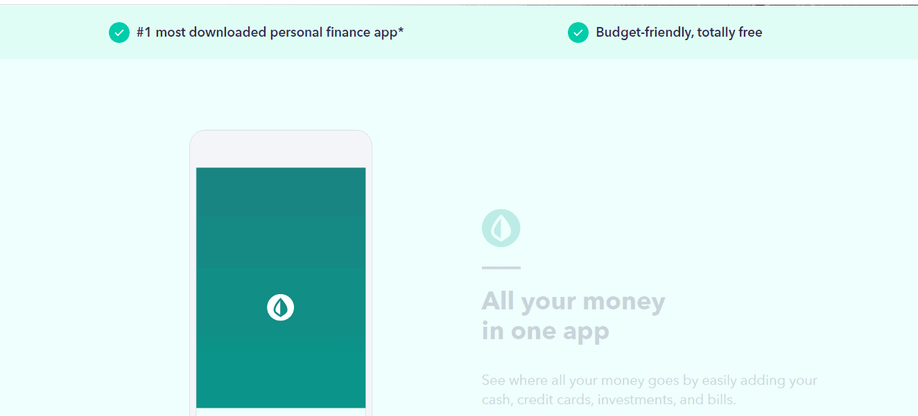
Summarise the benefit of your product or service into 1 sentence. What does it look like?
Drop it in the comment section below…
#6 Features
In addition to having benefits on your homepage, you also want to list the key features of your products/services.
This will help your users better understand your offerings and if it’s something they need. In the same way you have written your benefits, keep it simple, clear and easy to understand. The average user should be able to get what it is you are talking about.
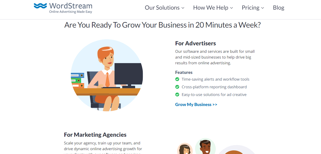
Notice how WordStream listed the features of their software and services in clear and direct language to their different audiences.
For marketing agencies and advertisers looking to get more results from online advertising, they are not confused on what exactly this brand offers them.
#7 Social Proof
Even if you have the best product in the world, your customers still need to be able to trust you. And what better way to do that than by including social proof on your website homepage.
People need to see proof that there are other people like them enjoying your services and so, you don’t want to leave this element out.
Social proof shows your visitor that you have expertise in what you are offering and can be trusted to deliver. They are also a great way to offer a positive first impression.
Including just a few quotes of your best testimonials along with their names and photos is effective in building trust with your potential customers.
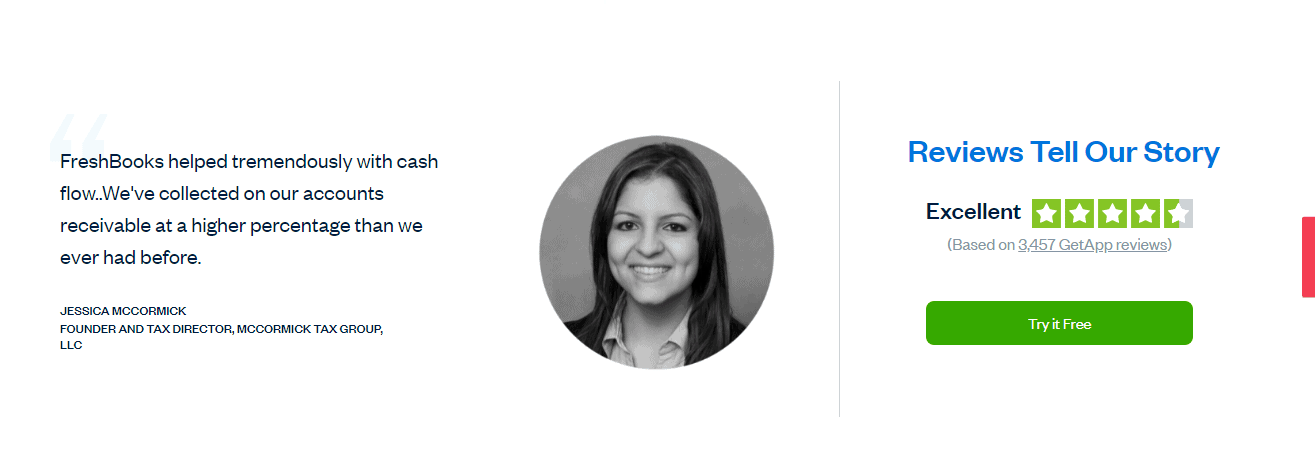
In this example, Freshbooks, a company that provides accounting solutions for business owners and accountants, included reviews and ratings from their customers on their homepage. Seeing such positive reviews is effective in building trust in the minds of those considering their services.
The more real your testimonials appear the better, you can include screenshots of customer reviews, a short testimonial video made by a client…
#8 Brand Photos
When it comes to designing the perfect website homepage, images matter. They are crucial in grabbing the attention of your visitors and also in conveying messages in a short time period.
Clear, high-quality images are a key element that you can’t leave out on your website’s homepage as they not only make your website look good but also helps in enhancing SEO. This is because users are more likely to spend longer time on your website when there are clear images.
Also, well optimized images make your website easier to index and increase your boost on search engines.
Images used on your website homepage should be well optimised for mobile users. Use a high-quality image with a reduced file size that doesn’t take forever to load.
Also, you don’t want to get lazy when it comes to selecting images used on your homepage. You want to invest in those that send the right messages and connect better with your brand. They need to be clear and provide visitors with an idea of what exactly your brand stands for and what it is you offer.
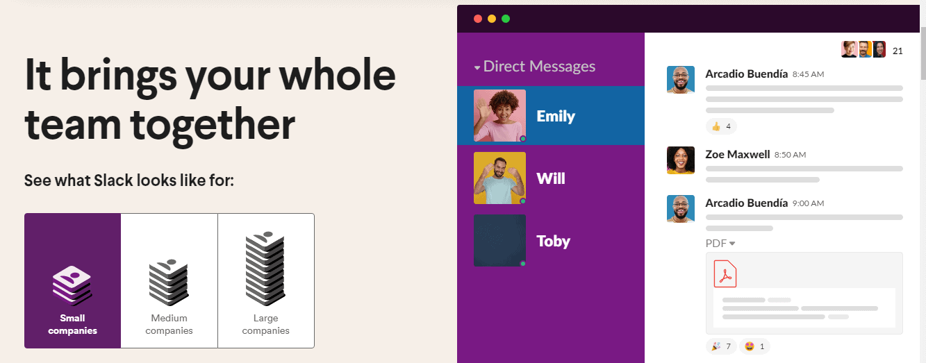
Check out how Slack used clear and simple screenshots on their homepage to further explain their offerings
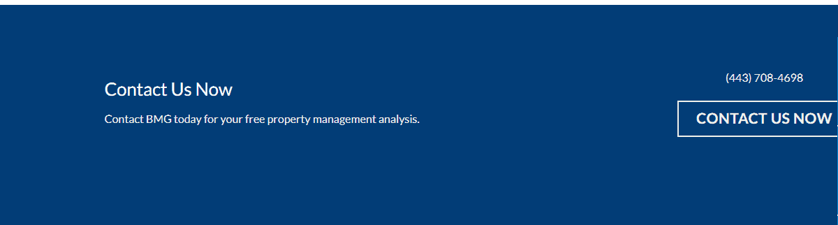
#9 Footer: Contact Information
This is one key element you just cannot afford to leave out: Contact Information! How will your visitors get in touch with your business if they can’t find contact information?
Contact information encourages your users to get in touch with you and also increases conversions.
You need to include a contact form, preferably on the header and footer of your website where your visitors can easily fill in their information and send messages directly to you.
Here is an example from Bay Management Group, a property rental company. With their bold contact us CTA, customers can easily contact them and find all the information they need.
Rounding up
And there you have it. Not many website homepages are perfect but a combination of these 9 elements puts you on the right track.
Now it is your turn:
What elements is your website homepage lacking? How can you begin to make the needed changes now?
Or are you yet to design your website? Now that you know must-have elements on your website, which ones do you consider most important?
Let us know your thoughts in the comment section below